


@morev/vue-transitions
适用于 Vue 2 和 Vue 3 的可复用界面过渡效果,无需 CSS ❤️
✔️ 可通过 props 高度自定义;
✔️ 在 group 模式下与 grid/flex 布局正确配合;
✔️ 考虑动画元素的初始样式,例如 transform 或 opacity;
✔️ 通过通用的 Nuxt 2 和 Nuxt 3 模块,使用起来更加简单。
目录
安装
❗ 要求
- Node 版本:
>= 18.0.0 - Nuxt 版本(如果使用):
>= 2.17.0 || >= 3.5.0
如果使用的 Node 或 Nuxt 版本低于指定版本,插件将无法工作。
使用 yarn
yarn add @morev/vue-transitions
使用 npm
npm install @morev/vue-transitions
使用 pnpm
pnpm add @morev/vue-transitions
使用 bun
bun add @morev/vue-transitions
❗ 关于 Bun 用户的重要说明
该包依赖 postinstall 钩子来确定 Vue 版本并提供适当的组件。
默认情况下,Bun 不执行生命周期钩子,因此要使其工作,您需要在安装后手动将该包添加到 trustedDependencies 中,然后再次运行 bun install。
{
  "trustedDependencies": ["@morev/vue-transitions"]
}
使用
如果您打算将此库与 Nuxt 一起使用,可以跳过以下段落。
前往“与 Nuxt 一起使用”部分.
包导出两个版本的组件
- 适用于
Vue2的版本可通过命名导出/vue2获取 - 适用于
Vue3的版本可通过命名导出/vue3获取
然而,也存在一个映射到正在使用的 Vue 本地版本的默认导出。
其内部利用了 postinstall npm 钩子。
安装包后,脚本将开始检查已安装的 Vue 版本,并根据本地 Vue 版本重定向导出。
这感觉相当可靠,但如果您担心,请根据您使用的版本优先选择显式命名导入。
顺便说一下,您可以在安装后更改默认导出:只需运行命令
vue-transitions-version-switch <version>
- 使用
yarn的示例:yarn vue-transitions-version-switch 2- 使用
npx的示例:npx vue-transitions-version-switch 3
全局注册
使用 Vue3
import { createApp } from 'vue';
import { plugin as vueTransitionsPlugin } from '@morev/vue-transitions';
import '@morev/vue-transitions/styles';

const app = createApp(App);

app.use(vueTransitionsPlugin({
  // Plugin options (optional, described below)
}));
使用 Vue2
import Vue from 'vue';
import { plugin as vueTransitionsPlugin } from '@morev/vue-transitions';
import '@morev/vue-transitions/styles';

Vue.use(vueTransitionsPlugin, {
  // Plugin options (optional, described below)
});
😥 我收到错误“找不到此依赖项”
对于无法解析 exports 字段的环境(例如 Nuxt 2),只需将样式导入替换为文件的直接路径即可。
- import '@morev/vue-transitions/styles';
+ import '@morev/vue-transitions/dist/index.css';
自定义选项
设置自定义选项时,建议使用命名导出
plugin而不是默认导出,以获得正确的类型信息。
自定义选项允许更改默认属性值。
要更改默认值,请将 defaultProps 键传递给插件设置,列出所需属性的键值对。
您还可以针对每个组件更改默认属性,为此只需将 componentDefaultProps 键传递给插件设置。
重要提示:这些属性未经验证,因此请确保您使用正确的值定义它们。
import { createApp } from 'vue';
import { plugin as vueTransitionsPlugin } from '@morev/vue-transitions';
import '@morev/vue-transitions/styles';

const app = createApp(App);

app.use(vueTransitionsPlugin({
  // Default duration for all transitions now is `200`
  defaultProps: {
    duration: 200,
  },
  // But for `<transition-expand>` default duration is `500`
  componentDefaultProps: {
    TransitionExpand: {
      duration: 500,
    }
  }
}));
直接导入组件
<template>
  <transition-fade>
    <div v-if="isVisible" class="box">
      Fade transition
    </div>
  </transition-fade>
</template>

<script>
  import { TransitionFade } from '@morev/vue-transitions';

  export default {
    components: { TransitionFade },
  };
</script>
与 Nuxt 一起使用
该库通过命名导出 /nuxt 导出了一个适用于 Nuxt 2 和 3 的开箱即用通用模块。
使用 Nuxt 时,建议使用模块而不是手动安装,因为
- Nuxt 允许按需自动导入组件,而不是全局注册,这是一种性能更好的选择。
- 这样更快:)
要使用它,请将 @morev/vue-transitions/nuxt 添加到 nuxt.config.ts / nuxt.config.js 的 modules 部分中。
export default defineNuxtConfig({
  modules: [
    '@morev/vue-transitions/nuxt',
  ],
  vueTransitions: {
    // The same options as in the plugin itself.
    // You will get an autocomplete using Nuxt 3.
  }
});
尽情享受您的过渡组件吧!🎉
智能感知
如果您使用 Nuxt 模块,可以跳过此部分 - 模块会为您完成此操作。
此部分仅适用于 VSCode 设置和组件的全局注册。
使用 Vue 2
使用 Vue 2 并安装了 Vetur 扩展程序,所有组件都应提供提示,无需任何操作。
使用 Vue 3
使用 Vue 3 并安装了 Volar 扩展程序,所有组件都应提供提示,无需任何操作。
过渡列表
TransitionFade
基本的过渡效果,改变元素的 opacity。非常简单。
显示代码
<template>
  <transition-fade>
    <div v-if="isVisible">...</div>
  </transition-fade>
</template>

<script>
  import { TransitionFade } from '@morev/vue-transitions';

  export default {
    components: { TransitionFade },
  };
</script>
TransitionExpand
操纵实际元素大小的过渡效果。
如果您年纪够大,您可能知道这种过渡效果就是 jQuery slideUp/slideDown。
它也可以与 X 轴一起工作,例如 slideLeft 和 slideRight(尽管我很难想出它真正需要的场景)。
有一个独特的 prop: axis
TransitionSlide
通过 transform: translate() 操纵元素位置的过渡效果。
它需要 offset prop 来计算所需的元素位置,并且可以使用百分比值。
如何使用 offset prop 的示例
<template>
  <!--
    Element will fade in and fade out to top.
    Initial transform is `transform: translate(0, -16px)`
  -->
  <transition-slide :offset="[0, -16]"></transition-slide>

  <!--
    Element will fade in and fade out to bottom left side.
    Initial transform is `transform: translate(-16px, 16px)`
  -->
  <transition-slide :offset="[-16, 16]"></transition-slide>

  <!--
    Element will fade in and fade out to right,
    and the offset will be relative to the element width itself.
    Initial transform is `transform: translate(100%, 0)`
  -->
  <transition-slide :offset="['100%', 0]"></transition-slide>

  <!--
    Element will fade in from top and fade out to bottom,
    and the offset will be relative to the element height itself.

    Transform before element appears: `transform: translate(0, -100%)`
    Transform when element disappears: `transform: translate(0, 100%)`
  -->
  <transition-slide
    :offset="{
      enter: [0, '-100%'],
      leave: [0, '100%']
    }"
  ></transition-slide>
</template>
它尊重通过 CSS 应用到元素本身的变换,并将其与定义的偏移量合并。
这非常有用,例如,当您尝试制作居中下拉菜单时。
👀 显示 `transform` 合并的示例
<template>
  <div class="block">
    <!--
      In this case, given the CSS styles,
      initial transform will be calculated to `translate(-50%, -16px)`
    -->
    <transition-slide :offset="[0, -16]">
      <div class="block__dropdown" v-if="isVisible">
        ...
      </div>
    </transition-slide>
  </div>
</template>

<style>
  .block {
    position: relative;
  }

  .block__dropdown {
    position: absolute;
    top: 100%;
    left: 50%;
    transform: translateX(-50%);
  }
</style>
有一个独特的 prop: offset
TransitionScale
操纵元素 transform: scale() 的过渡效果。
默认情况下,它将元素从 scale(1) 缩放到 scale(0),但此行为可以通过 :scale prop 进行自定义。
它通过 axis prop 处理不同的轴。
具有独特 props: scale、 axis、 origin
显示代码示例
<template>
  <!--
    This element appears in `x` axis and disappears in `y`
  -->
  <transition-scale :axis="{ enter: 'x', leave: 'y' }"></transition-scale>

  <!--
    This element behaves like the `transition-expand`,
    but touches only `transform` property
  -->
  <transition-scale transform-origin="50% 0%"></transition-scale>

  <!--
    This element scales just a little when fading in/out.
  -->
  <transition-scale :scale=".8"></transition-scale>

</template>
属性
通用 props
这些属性与每个过渡效果相关
group
组件是否应为 transition-group 组件。
export type TransitionGroup = boolean; // Default: false
示例
<template>
  <div>
    <!--
      To animate a list of items, use `group` prop.
      ⚠️ Don't forget you should pass the `:key` to each item in this case.
    -->
    <transition-fade group>
      <div v-for="item in items" :key="item.id">...</div>
    </transition-fade>
  </div>
</template>
tag
在使用了 transition-group 组件的情况下,过渡的标签。
export type TransitionTag = string; // Default: 'span'
示例
<template>
  <div>
    <!--
      Passing the tag renders transition component with it.
      It's suitable, for example, for rendering semantic lists:
    -->
    <transition-fade group tag="ul">
      <li v-for="item in items" :key="item.id">...</li>
    </transition-fade>

    <!-- ✨ Rendered HTML: -->
    <ul>
      <li>...</li>
      <li>...</li>
    </ul>
  </div>
</template>
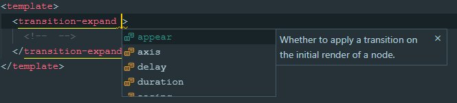
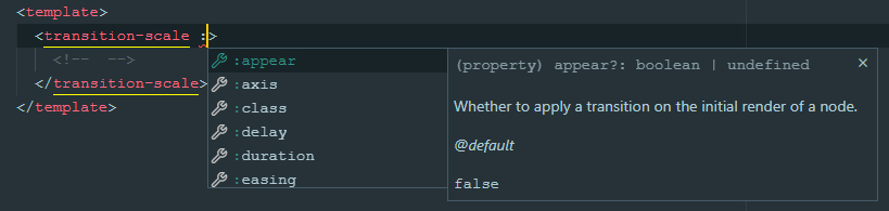
appear
是否在节点的初始渲染时应用过渡。其作用与原始的 Vue 过渡 appear prop 完全相同。
export type TransitionAppear = boolean; // Default: undefined
示例
<template>
  <div>
    <!--
      This element appears when mounted if `isVisible` is `true` by default.
    -->
    <transition-fade appear>
      <div v-if="isVisible">...</div>
    </transition-fade>
  </div>
</template>
模式
过渡模式.
export type TransitionMode = 'in-out' | 'out-in' | undefined; // Default: undefined
示例
<template>
  <div>
    <!--
      Current element transitions out first, then when complete,
      the new element transitions in.
    -->
    <transition-slide mode="out-in">
      <component :is="currentComponent">...</component>
    </transition-slide>
  </div>
</template>
duration
过渡动画持续时间,单位毫秒。
如果给定一个对象,则 enter 和 leave 值将分别用于进入和离开过渡。
// Default: 300
export type TransitionDuration = number | { enter: number, leave: number }
示例
<template>
  <div>
    <!--
      If single value provided, the passed amount of milliseconds
      applied to enter and leave animations both.
      This element will appear and disappear within 500ms:
    -->
    <transition-fade :duration="500">
      <div v-if="isVisible">...</div>
    </transition-fade>

    <!--
      If an object given, it SHOULD have `enter` and `leave` keys.
      This element appears in 200ms and disappears within 500ms:
    -->
    <transition-fade :duration="{ enter: 200, leave: 500 }">
      <div v-if="isVisible">...</div>
    </transition-fade>
  </div>
</template>
move-duration
在使用 transition-group 时,元素位置变化的动画持续时间。
尽管 Vue 没有通过 props 设置移动动画持续时间的本地方法,但此任务可以通过 CSS 自定义属性完成。
👀 显示解释
<!-- This way it can be set dynamically -->
<div style="--move-duration: 300ms;">
  <div class="scale-move"></div>
  <div class="scale-move"></div>
</div>
```

```css
.scale-move {
  transition-duration: var(--move-duration, 300ms);
}
```

</details>

```ts
// Default: 300
export type TransitionMoveDuration = number;
delay
过渡动画延迟,单位毫秒。
如果给定一个对象,则 enter 和 leave 值将分别用于进入和离开过渡。
// Default: 300
export type TransitionDelay = number | { enter: number, leave: number };
示例
<template>
  <div>
    <!--
      If single value provided, then enter and leave animations will wait
      for given amount of milliseconds before run.
      This element will appear and disappear 100ms after
      `isVisible` property changes:
    -->
    <transition-fade :delay="100">
      <div v-if="isVisible">...</div>
    </transition-fade>

    <!--
      If an object given, it SHOULD have `enter` and `leave` keys.
      This element appears immediately and disappears 200ms after
      `isVisible` property changes:
    -->
    <transition-fade :duration="{ enter: 0, leave: 300 }">
      <div v-if="isVisible">...</div>
    </transition-fade>
  </div>
</template>
easing
过渡动画缓动函数。应为有效的 CSS 过渡计时函数。
如果给定一个对象,则 enter 和 leave 值将分别用于进入和离开过渡。
export type TransitionEasing = string; // Default: 'cubic-bezier(.25, .8, .5, 1)'
示例
<template>
  <div>
    <!--
      If single value provided, then enter and leave animations will use it:
    -->
    <transition-fade easing="ease-out">
      <div v-if="isVisible">...</div>
    </transition-fade>

    <!--
      If an object given, it SHOULD have `enter` and `leave` keys.
      This element uses custom animation known as `bounce-in` for entering
      and simple `ease-out` curve for leaving:
    -->
    <transition-fade
      :easing="{
        enter: 'cubic-bezier(0.6, 0, 0.4, 2)',
        leave: 'ease-out'
      }"
    >
      <div v-if="isVisible">...</div>
    </transition-fade>
  </div>
</template>
no-opacity
是否不动画元素的 opacity。
默认情况下,每个过渡除了主属性外,还会操作 opacity。
然而,有时这并不是必需的——例如,在实现从屏幕边缘出现的模态面板时。
此 prop 显然不适用于
transition-fade组件。
export type TransitionNoOpacity = boolean; // Default: false
示例
<template>
  <div>
    <!--
      This panel appears from the right edge of the screen,
      while its transparency remains unchanged.
    -->
    <transition-slide :offset="['100%', 0]" no-opacity>
      <div class="panel" v-if="isVisible">...</div>
    </transition-slide>
  </div>
</template>

<style>
  .panel {
    position: fixed;
    top: 0;
    right: 0;
    bottom: 0;
    background: #ffffff;
    width: 400px;
  }
</style>
no-move
在使用 transition-group 时,是否不动画元素位置的变化。
默认情况下,当使用 group 模式时,当一个元素被移除时,剩余的元素会平滑地改变它们的位置。
它们被赋予了绝对定位并脱离了文档流,因此父容器的高度会塌陷。
通常这不是问题,但有时——例如,当使用 transition-expand 并且元素顺序排列时,它看起来会很粗糙。
通过此选项,您可以在这种情况下实现更令人愉悦的元素行为。
export type TransitionNoMove = boolean; // Default: false
示例
<template>
  <div>
    <!--
      In this case, the height of the parent element (`ul`) changes smoothly.
    -->
    <transition-expand group no-move tag="ul">
      <li v-for="item in items" :key="item.id">...</li>
    </transition-expand>
  </div>
</template>
TransitionExpand 的独有 props
axis
元素应展开的轴。
如果给定一个对象,则 enter 和 leave 值将分别用于进入和离开过渡。
type ExpandAxisValue = 'x' | 'y'; // Default: 'y'
export type TransitionExpandAxis = ExpandAxisValue | { enter: ExpandAxisValue, leave: ExpandAxisValue }
TransitionSlide 的独有 props
offset
过渡前后元素在 x 和 y 轴上的偏移量。
应为整数或百分比值的字符串表示形式(例如 '100%')。
数值被视为 px 偏移量,以 % 符号结尾的字符串值被视为 元素宽度/高度的百分比。
示例和解释
如果给定一个对象,则 enter 和 leave 值将分别用于进入和离开过渡。
type SlideOffsetValue = [number | string, number | string];

// Default: [0, -16]
export type TransitionSlideOffset = SlideOffsetValue | { enter: SlideOffsetValue, leave: SlideOffsetValue }
TransitionScale 的独有 props
axis
要动画的缩放轴。
* `both` (uses `transform: scale()`)
* `x` (uses `transform: scaleX()`)
* `y` (uses `transform: scaleY()`)
如果给定一个对象,则 enter 和 leave 值将分别用于进入和离开过渡。
type ScaleAxisValue = 'x' | 'y' | 'both';

// Default: 'both'
export type TransitionScaleAxis = ScaleAxisValue | { enter: ScaleAxisValue, leave: ScaleAxisValue }
origin
应用于元素(s)的 transform-origin CSS 属性。\
如果给定一个对象,则 enter 和 leave 值将分别用于进入和离开过渡。
如果给定一个对象,则 enter 和 leave 值将分别用于进入和离开过渡。
// Default: '50% 50%'
export type TransitionScaleAxis = string | { enter: string, leave: string }
scale
过渡前后元素的缩放值。应为 0 到 1 之间的数字。
如果给定一个对象,则 enter 和 leave 值将分别用于进入和离开过渡。
如果给定一个对象,则 enter 和 leave 值将分别用于进入和离开过渡。
// Default: 0
export type TransitionScaleScale = number | { enter: number, leave: number }
事件
组件不提供任何特殊事件,但会触发 所有标准过渡事件
before-enterenterafter-enterenter-cancelledbefore-leaveleaveafter-leaveenter-leave